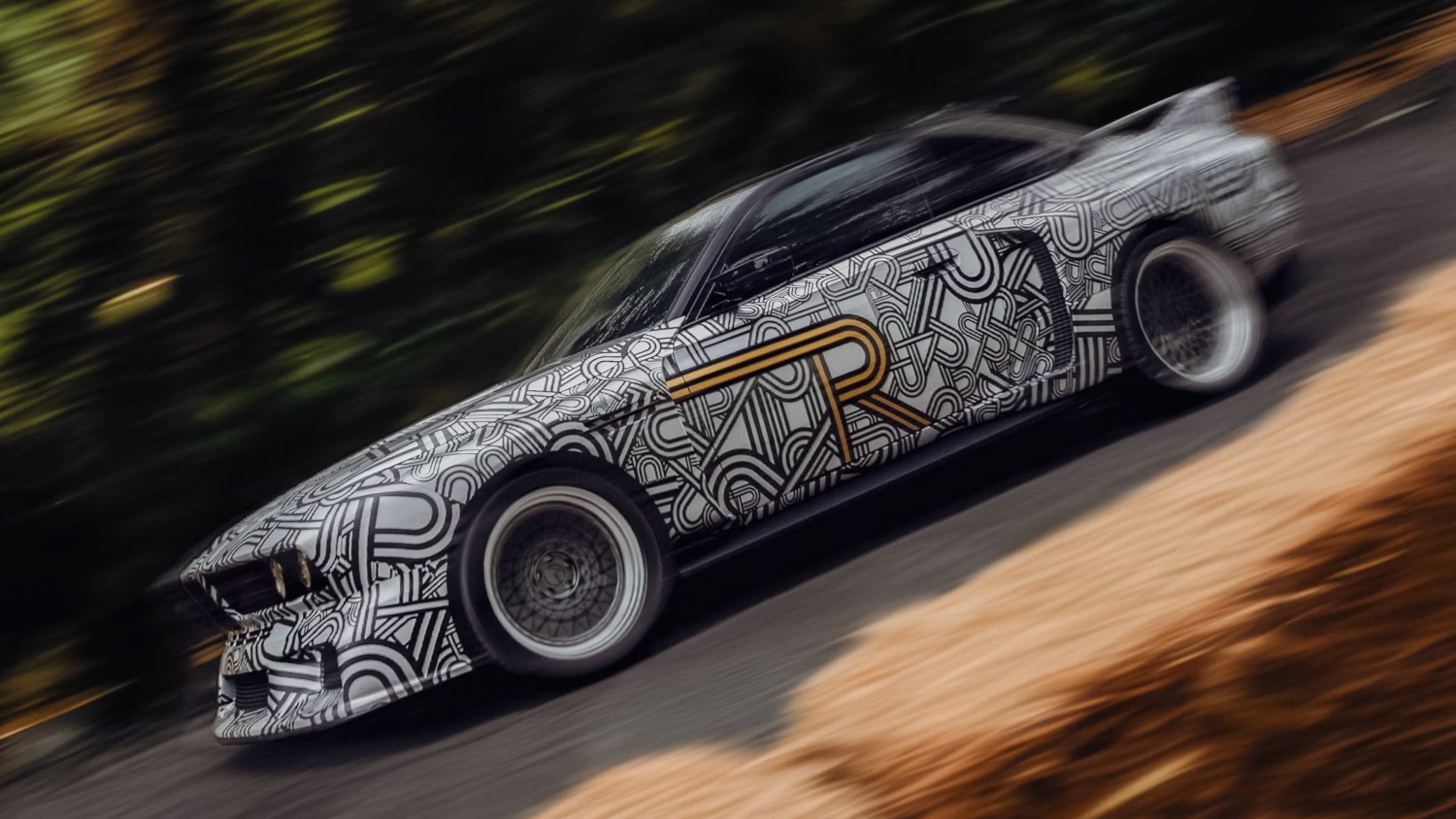


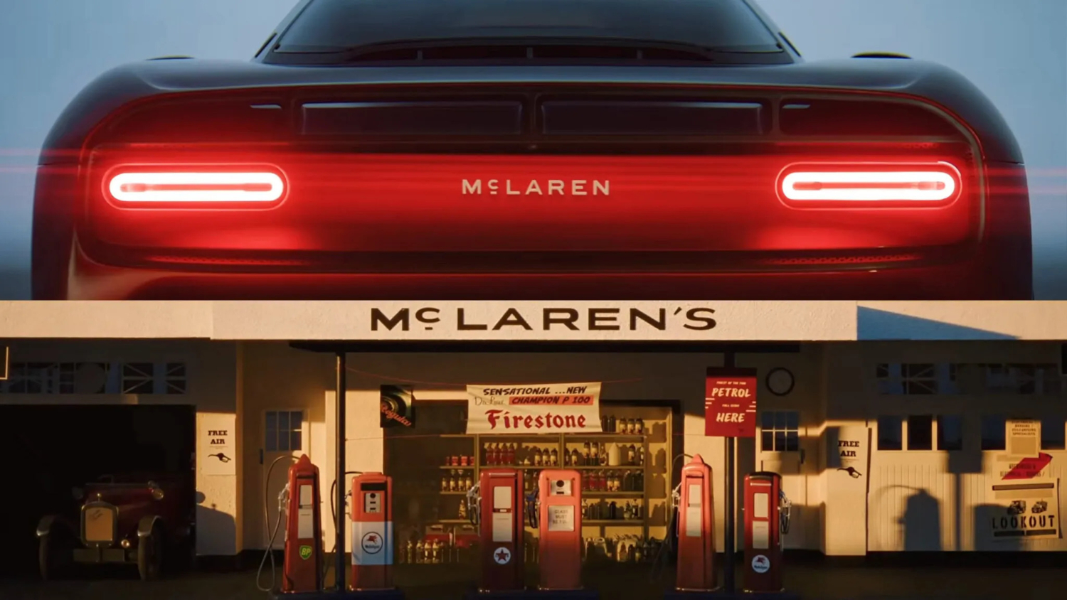
A supercar brand traced its new corporate identity back to a petrol station in suburban New Zealand. That’s the actual story. McLaren has replaced its previous mixed-case wordmark with a custom typeface called McLaren Sans — inspired by the sign above the Remuera Road service station Bruce McLaren’s parents ran in Auckland. The redesign covers McLaren Automotive and McLaren Racing simultaneously, already appears on the McL 6GT concept, and will roll out across future production vehicles, merchandise, showrooms, and digital platforms.
This isn’t cosmetic housekeeping. A reported £500 million expansion — a second UK factory, in-house engine production, an SUV reportedly before 2030 — needs a visual identity that can carry real weight. Prospective owners should be aware that cheap exotic cars can still carry significant hidden costs beyond the sticker price.
One Line Beneath a Letter, One Nod to a Garage
A single horizontal line beneath the “C” in McLaren Sans connects a billion-dollar brand to an Auckland garage sign.
McLaren Sans is uppercase and clean, and that horizontal line beneath the “C” mirrors the lettering on the original Remuera Road signage. The Speedmark remains part of the brand — McLaren says it stays “at the heart” of the identity — and the Speedy Kiwi is retained alongside it.
The color palette draws on history too. Papaya, Ember, Midnight, Anthracite, Colnbrook silver, and Mist white were reportedly pulled from a photograph of Bruce McLaren sitting on the tire of one of his single-seaters. Every decision points somewhere specific.
- Les and Ruth McLaren’s service station, Remuera Road, Auckland: the wordmark’s inspiration
- McLaren Sans: bespoke, uppercase, horizontal line beneath the “C” mirrors the original sign
- Speedmark and Speedy Kiwi: both retained within the updated brand system
- First application: McL 6GT, a manual V8 concept with heritage design references
- Rollout: future vehicles, merchandise, showrooms, and digital platforms
Bruce McLaren modified an Austin Seven at that garage and competed in and won a hill climb at Muriwai. That workshop instinct — strip it back, make it faster, understand every component — is what built McLaren. Chief Creative Officer David Woodhouse says the identity reflects the company’s “ambition, creativity, innovation and forward momentum.” Standard executive language, perhaps. But anchoring a rebrand to a specific family garage sign, rather than a mood board, is a genuinely unusual call.
A Bigger Brand for a Bigger McLaren
The wordmark now has to stretch across road cars, racing, and a forthcoming SUV without losing its shape.
McLaren describes the refresh as unifying “past, present and future” across both divisions, promising “deeper personalisation, richer experiences and a stronger sense of community” for owners and fans. A front-engined, multi-seat performance SUV — expected before 2030 — will introduce the brand to buyers who may never have considered a two-seat mid-engined supercar. That’s a significant stretch for any identity to absorb.
One of the most performance-focused names in road cars just anchored its next chapter to a family service station in Auckland. Bruce McLaren won a hill climb at Muriwai in an Austin Seven he built there. The logo remembers that. Whether the SUV will is a different question entirely.